Bethnal Green Museum of Childhood -reopens
The V&A Museum of Childhood at Bethnal Green reopened and we visited on its second weekend open. I think it is disappointing.
To me the overriding problem of the old museum was that it was not much fun - it was a traditional object-orientated display-case Museum that was really designed for adults revisiting their childhood toys. It was not really designed for children - the museum of childhood not the museum for children
Not much has really changed. On the plus side are new front-of-house facilities, education rooms, toilets, a lovely new pink/lilac paintjob for the old corrugated iron shed, new cases, more interactives and hands on activities (a surprising number of which are 'out of order)' And yes there is definitely more fun here for the kids but the displays are still traditional case bound object displays and it is still a Museum of Childhood and not really a children's Museum.
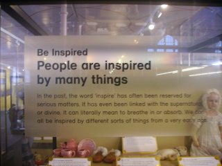
The objects are still in rectangular cases of particular dullness, an attempt has been made to impose a narrative structure on the objects but it fails. Visitors will adore the objects, the toys, the dolls, the robots, the dolls houses, but will learn precious little about childhood through the ages and not much more about the history of toys other than that which will be gleaned from the objects themselves. The narrative panels sometimes seem written for a post-modern adult and sometimes to encourage kids to explore - but they fail to engage and I suspect most people don't bother to engage with them.
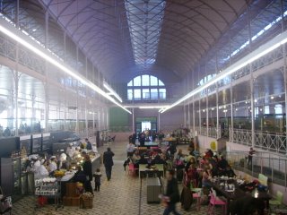
The architects have done a good conservative job inside - experimenting only with the colour, but the open plan nature of the building causes problems - it now seems a lot noisier than it used to and the cafe smell pervades the space. The Cafe seems no better than the one it replaced and it fills exactly the same space. The shop is also not a fantastic toy shop - which surely it should be?
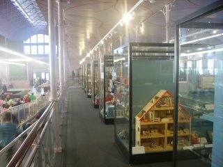
The exhibition designers seem to have been working on a shoe string - the downstairs cases are ok but uniform and dull, the upstairs cases are quite terrible, old cases reused with new system designed wooden interiors - the dressing is really not up to much at all, very lifeless. Also upstairs is a multicultural inclusive display on the local area. I suspect it might have been ok in a local museum but the design gets lost in the huge space and as part of a large relaunch it seems very weak.
The new front entrance block seems also to be designed not to fit in with the 19th building at all - the old V&A 'boiler house' have a triangular roof line, semi-circular arches and red brick, the new front entrance is a blocky square clad like a London Mosque and does not fit in with the original building at all not in colour, in shapes and forms or in mood.

To sum up, it is competent piece of conservation architecture inside, a lack-lustre exhibition in side and the Museum has failed to take advantage of a £4.7m chance to reinvent itself.
For interviews with the architect and director follow the link:
BBC - London - TV and Radio - The V&A Museum of Childhood unveils its million pound transformation

To me the overriding problem of the old museum was that it was not much fun - it was a traditional object-orientated display-case Museum that was really designed for adults revisiting their childhood toys. It was not really designed for children - the museum of childhood not the museum for children

Not much has really changed. On the plus side are new front-of-house facilities, education rooms, toilets, a lovely new pink/lilac paintjob for the old corrugated iron shed, new cases, more interactives and hands on activities (a surprising number of which are 'out of order)' And yes there is definitely more fun here for the kids but the displays are still traditional case bound object displays and it is still a Museum of Childhood and not really a children's Museum.
The objects are still in rectangular cases of particular dullness, an attempt has been made to impose a narrative structure on the objects but it fails. Visitors will adore the objects, the toys, the dolls, the robots, the dolls houses, but will learn precious little about childhood through the ages and not much more about the history of toys other than that which will be gleaned from the objects themselves. The narrative panels sometimes seem written for a post-modern adult and sometimes to encourage kids to explore - but they fail to engage and I suspect most people don't bother to engage with them.
The architects have done a good conservative job inside - experimenting only with the colour, but the open plan nature of the building causes problems - it now seems a lot noisier than it used to and the cafe smell pervades the space. The Cafe seems no better than the one it replaced and it fills exactly the same space. The shop is also not a fantastic toy shop - which surely it should be?

The exhibition designers seem to have been working on a shoe string - the downstairs cases are ok but uniform and dull, the upstairs cases are quite terrible, old cases reused with new system designed wooden interiors - the dressing is really not up to much at all, very lifeless. Also upstairs is a multicultural inclusive display on the local area. I suspect it might have been ok in a local museum but the design gets lost in the huge space and as part of a large relaunch it seems very weak.

The new front entrance block seems also to be designed not to fit in with the 19th building at all - the old V&A 'boiler house' have a triangular roof line, semi-circular arches and red brick, the new front entrance is a blocky square clad like a London Mosque and does not fit in with the original building at all not in colour, in shapes and forms or in mood.

To sum up, it is competent piece of conservation architecture inside, a lack-lustre exhibition in side and the Museum has failed to take advantage of a £4.7m chance to reinvent itself.
For interviews with the architect and director follow the link:
BBC - London - TV and Radio - The V&A Museum of Childhood unveils its million pound transformation
Comments